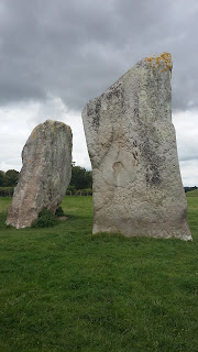
 We travelled a by now familiar route out towards Devizes, through the weird hills and villages of Wiltshire. Then further on to Avebury, home of the Stones. It always strikes me as strange how many other people wake up and have exactly the same thought as we did, to go and visit them on that very day. (Although they had not had the same thought about visiting the font). However it wasn't heaving, and there were large enough spaces between other visitors not to feel like we were at Stonehenge or something. As I had forgotten the tea flask we used it as an excuse to have a cream tea at the cafe, which was very nice. Then we had a wander around the Stones, which are remarkably large, solid and smooth in places, and you have to wonder what it was all about. Even though we were walking round them in a circle, I got a bit disorientated but I enjoyed the calm feeling and seeing the sheep grazing in the middle.
Our main objective was of course to see the font in the local church, which has a fair few more visitors than your average village church. Most people just glanced at the font, if they noticed it at all, even though we were both sitting attempting to draw the detailed and swirling design on it, that is worn with time. The main features are two dragony/wyverny creatures with what I think were unusual amounts of detail, in the patterning down their sides. Very pleasing. I was drawing one with a particularly delightfully curving tail. There was also a human figure, face bizarrely obliterated by a metallic thing, perhaps part of an old lock. Above the figures were swirls reminiscent of several places, I shall have to look up - and below, an interlinking archways/pillars design very reminiscent of Durnford font. I am sure with our extensive knowledge now, we should write a book making observations, as we have been able to see many links and similar designs throughout our travels that other people (the handful who also have this obsession) may not have seen.
We decided to squeeze in another font, just up the road in the next village, Winterbourne Monkton. My sister has visited both before as I remember seeing her previous drawings, but it is always nice to re-visit. And for me they were both new. We really were out in the middle of nowhere, or so it felt, and there were butterflies joining us as we had our picnic lunch. This font was another elaborately carved and very striking design, which carried traces of paint from years ago, including blue and red. Then it seemed only too fitting that I used my new colour pens in their fancy case, which are fine-tipped. I am quite pleased with my drawing as I depicted different areas of the design in different colours. The bold zig-zag band that forms the main part had traces of blue on it. There is a human-oid figure with splayed out legs and arms, possibly other bits, or is this part of the whirly flower design that fits neatly above and below the zigzags. I think it was put there because if you imagine it removed, the zigzag design would not meet up neatly - you can imagine, can't you, the carver getting round to the end of the pattern and realising it was not really going to work out. A bit like the strikingly free-hand looping patterns at Hinton Parva. I was not good at depicting the deep cut trumpet design below the zigzags, something my sister did with much more 3D success.


No comments:
Post a Comment