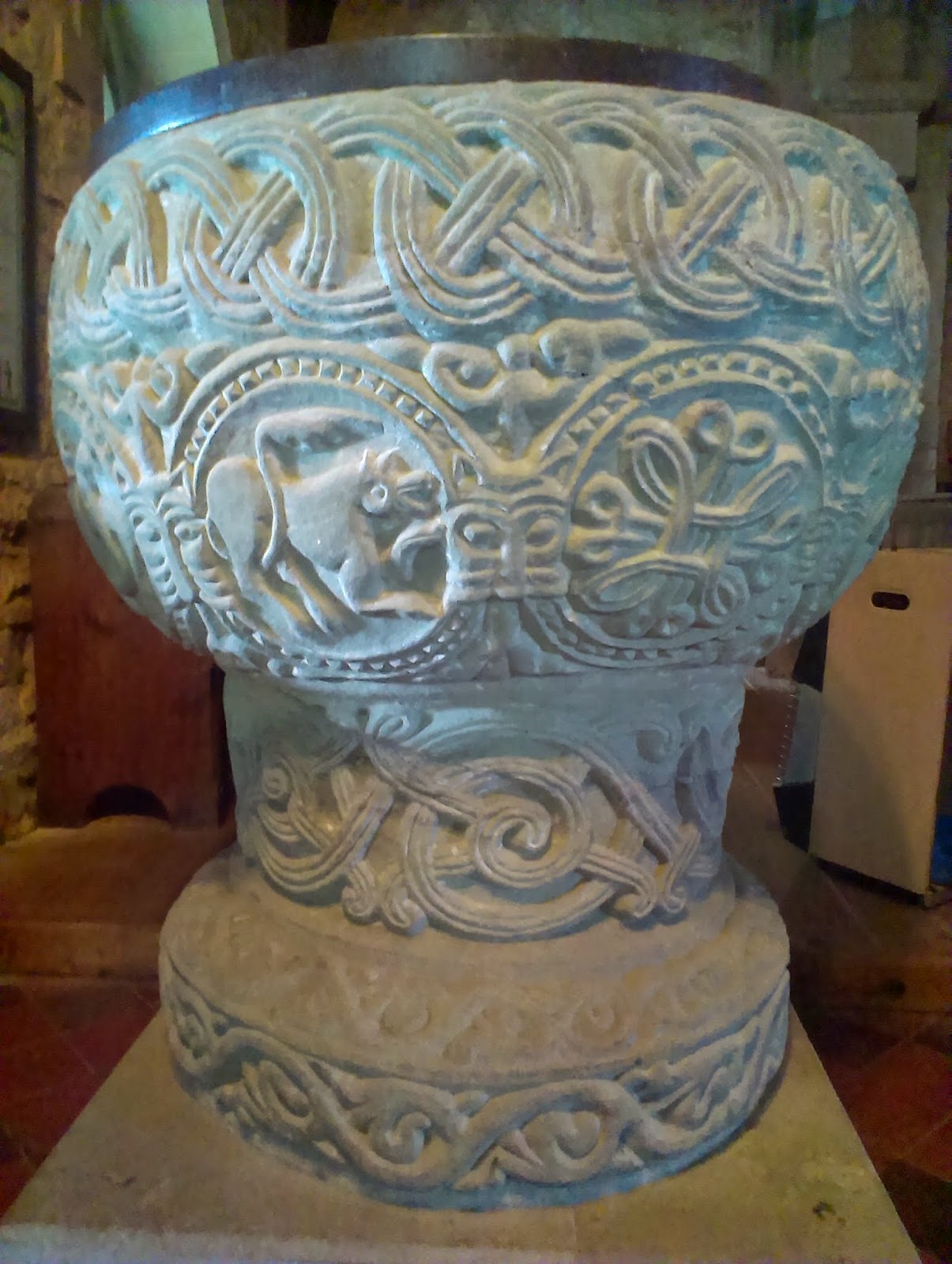
 The first one seemed to be in the back of beyond, in Stottesdon, a village in Shropshire. It was tucked out of the way and it seemed very dark inside, so that we had to open the front doors to get a decent look at the font. It was very large, and covered in the most impressive carvings. Both of us stood and stared in amazement (once we could see it clearly). The top has a wide band of interlaced plaiting around it, the centre has animals in circles, and cats' faces where the circles touch. We were both thrilled to see another lamb of God and this one - yet again - looked like a dolphin's head. Perhaps it is hard to carve lambs or perhaps they were copying the style of the time. There was a rather appealing bull/cow/type creature, a dragon biting its own tail (possibly) and some excellent birds. The base was very fancy as well, with interlacing designs. It was all very impressive.
 Hidden out of view, behind the ugly organ, was a tympanum over the south door. It was hard to see in the gloom and looked quite worn anyway - there were two upside down creatures and a third upright one.
We were unimpressed by the arrival of a woman who was more bothered about why we had (inadvertently) turned on the lights at the end of the drive, instead of sharing with us how lucky she was to be a member of a church with such an amazing example of a font of the Herefordshire school.
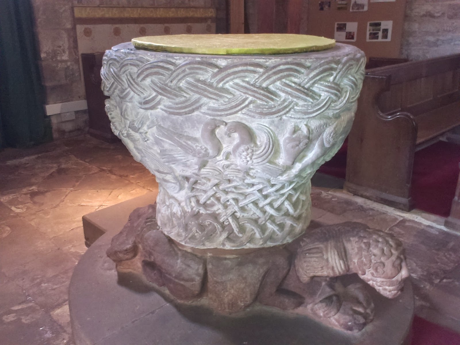
 But if we thought that was good, Castle Frome held even more excitement. We nearly didn't stop to see it and we nearly didn't find the right village, but it was a good job we did. The church is really sweet and sits out of the way of the village. The outside is unusual and the porch and doorway is plain - because of this I wondered naively whether it would be good. But the door swung open and my sister literally gasped with excitement: inside, not hidden this time in darkness, is a marvellously ornate and beautifully carved font - very large and round, carved from one block, sitting on a base of strangely crouching figures (two that have lost their heads). The carving on the font was deep and sort of chunky, very tactile, although I managed to keep my hands off it, and so impressive. Around the bowl are the four evangelists in symbolic form: an angel, an eagle, a lion and a very charming bull. There are also two wonderfully observed birds, with their claws touching and their beaks jaunty, as well as a depiction of Jesus at his baptism, with John the Baptist, the hand of God and the Holy Spirit in the form of a dove. Jesus is particularly well done as he is standing in a pool of rippled water and you see the shape of his body through the ripples. In the pool are some fabulous fish. My sister noticed that the human figures all had ankles with little circles on them, like an ankle joint.
It was better than tv and I imagine that these sort of pictures would have entertained the people of their time in much the same way that good tv can do these days. We were pleased because we actually noticed some similarities to the other font, and how the creatures all have long claws, and how the lion's tail comes up and curves over his body, exactly like the creatures at Ampney St Mary. We then read that these are features of the Herefordshire School style.
The base of the font was an intricate knotwork of patterns. No doubt it would have been tricky to draw. Sadly we were unable to stay long enough to draw this font, but it is one I would love to return to. The birds were particularly pleasing and the whole thing was beautifully preserved. The church community seemed to value and appreciate what they have there, from what I could see. If you are ever passing by, pop in. You will not be disappointed.


No comments:
Post a Comment