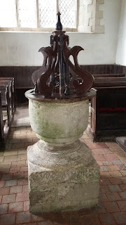
Another trip fonting took in Berwick St James (some previously unseen criss cross designs above the door), Winterbourne Stoke (a very pleasing font, small but chunky, sadly with the most hideous and out of place but apparently historical Jacobean font cover. We did not include it in our drawings). The archway over the entrance had some nice blob shape designs. We had a disappointing trip to Amesbury, where the priory was closed (what happens if you are religious and seeking solace, or persecuted and seeking sanctuary? Not much good if the church is shut), we stopped to enjoy the clear waters of the Avon where some ducks were having a good time. Some keen walkers strode over the bridge, making it bounce rather uncomfortably. Another example of when people walking seem to think the point is to get from A to B in the quickest possible time, instead of actually looking at what is around them.
On to Durnford, described rather simply by Pevsner so that we were expecting merely a font with some sort of design on it. (All our trips are based on the information taken from
Nikolaus Pevsner's architectural guides. He and his wife spent many years going from church to church across the UK, while he documented everything. From this my sister has extracted the bits about Norman and Saxon architecture. How he had time to look at everything we marvel to comprehend. But then again he does sometimes miss things out or gloss over the most amazing features. And we can understand why - just doing 4 or 5 churches is sometimes exhausting). This was the case in Durnford. We weren't expecting much. But it was quite amazing. Over the doorway were some wonderful and unusual shapes that look like shuttlecocks. I pushed open the big heavy oak door (I love some of these old doors! They are from centuries ago). I looked round. I gasped. The font was amazing. So intricately and elaborately carved with a design covering all of it. The design looked like little faces. That would be hard to draw... I looked round again. Gasped. There were carvings in the wall. Looked more. Gasped. Remnants of paintings on the wall. Went further in and looked at some capitals - gasped - 2 perfectly preserved and hilarious animals. Read about the church from their information. Gasped. The back pews were 16th century. Drawing the fabulous font was of course tricky but fun, specially sitting on the ancient pews.
 |
| Durnford font |
 |
| Durnford, a smiling bird |
 Another trip fonting took in Berwick St James (some previously unseen criss cross designs above the door), Winterbourne Stoke (a very pleasing font, small but chunky, sadly with the most hideous and out of place but apparently historical Jacobean font cover. We did not include it in our drawings). The archway over the entrance had some nice blob shape designs. We had a disappointing trip to Amesbury, where the priory was closed (what happens if you are religious and seeking solace, or persecuted and seeking sanctuary? Not much good if the church is shut), we stopped to enjoy the clear waters of the Avon where some ducks were having a good time. Some keen walkers strode over the bridge, making it bounce rather uncomfortably. Another example of when people walking seem to think the point is to get from A to B in the quickest possible time, instead of actually looking at what is around them.

No comments:
Post a Comment